

For those who can't make the journey, Bert also has a book of his artwork available for purchase. We have a copy and I find it inspiring to thumb through because he uses such vibrant and invigorating colours.


I might have some other ways for you to get your hands on some of Bert's art, but first let's take a tour around the Brickworks exhibit. I tried my best to capture the beautiful paintings on display, but the lighting is a bit dim (and a bit fluorescent) there, so it was tricky. You can also see his work on his website.
The showstopper is this 32 foot (!!!) painting, called Transitions, painted in 1978. Hubby's standing in front, for scale. Incredible, right?
| Transitions, 1978 |

In the same space as Transitions are these four pieces:

I surprised myself by favoring not the blue painting, Winter Balsam (second from the left above)...
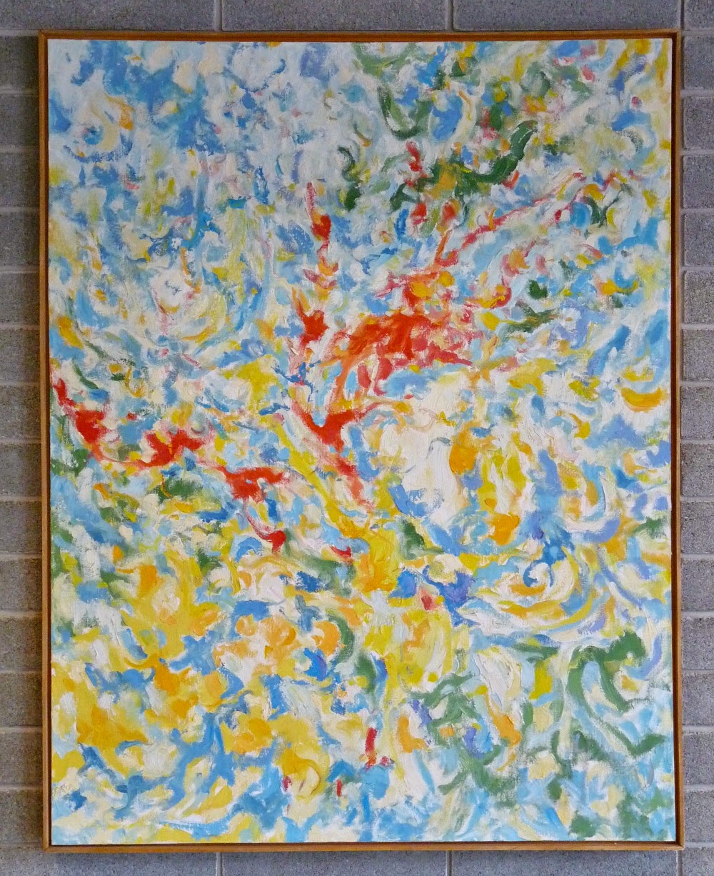 |
| Winter Balsam, mid 1970s |
 |
| October Red, 1977 |


This is why I advocate buying a piece of art you love, and pulling colours from it to decorate a room. Artists just get colour - they have an innate sense of what colours look good together. Design a room around the painting above and it will look stunning.
Brickworks is a great space and it was such a change to see Bert's art against brick walls with history, but his paintings really belong in the space.
 |
| After the Red, 2012 |
 |
| Full Summer, 2012 |

When we went to Brickworks, Hubby and I were told that the conference room which houses the Wave Series was booked, so we weren't allowed entry. There was no way Hubby and I were going to drive more than 3000km and not see these paintings. Hubby didn't want to interrupt (he's so polite!), so I steeled myself, prepared for a bit of confrontation and barged right in but, to my surprise, the room was empty. We were able to take in these paintings in peace and quiet, which was lovely. Can you imagine having something so beautiful to look at during your next meeting? Lucky ducks.
 |
| Wave Series # 7, 1989 |
 |
| Wave Series #4, 1988 |

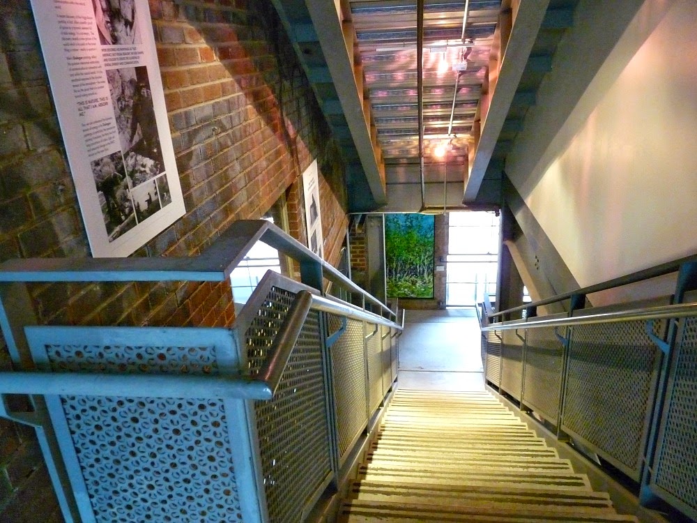
I can only imagine how disappointing it will be for everyone who uses this space when Bert's work is removed at the end of September. Having such beauty in the workplace must make it so much more enjoyable - I imagine it would spark a lot of creativity, too! Just look at this hallway:


If I remember correctly, The Purples of Fall is down the corridor pictured above. It's another painting with purple that caught my eye... Hmmm.
 |
| The Purples of Fall, 2010 |

At the end of the hall is another one of my favorites, New Growth, from the Bush Wall Series.
 |
| New Growth, 2010 |

There are many more paintings at Brickworks, so if you have a chance stop by. If you happen to share a photo on Instagram or Twitter, I'd love if you'd use #BertWeir and tag me so I can see! I'd be happy to pass on your thoughts and experiences to Bert.
For those of you who are as smitten with Bert Weir's art as we are, you can always contact him directly (a studio tour can be arranged by appointment), but Hubby's Mom chatted with me recently about the possibility of selling signed, limited edition prints of his work ($100-200 range) or smaller original paintings. Because I know that many of you, like me, are on a tight budget, there's also the possibility of notecards with images of his work...the sky is really the limit because Bert's wife is a talented photographer and she has cataloged and documented his extensive body of work. For anyone who has ever asked about Bert's art, what would interest you? Prints? Smaller original paintings? Notecards? Something else? What would be your budget? Let me know what you think.
No comments:
Post a Comment